Research point: Look at the works of Vuillard, Mary Cassatt and Degas and make notes on their approaches to composition.
Edouard Vuillard
Vuillard frequently uses a portrait format which makes a dynamic composition. These charcoal studies are very linear and loose, you can see a table near a wall with picture frames hanging.

Vuillard charcoal study
Below I can see he is using a corner with pictures helping to emphasise the corner walls with foreshortening. The figures on the bench create a focal point.
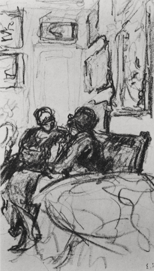
Charcoal study, Vuillard
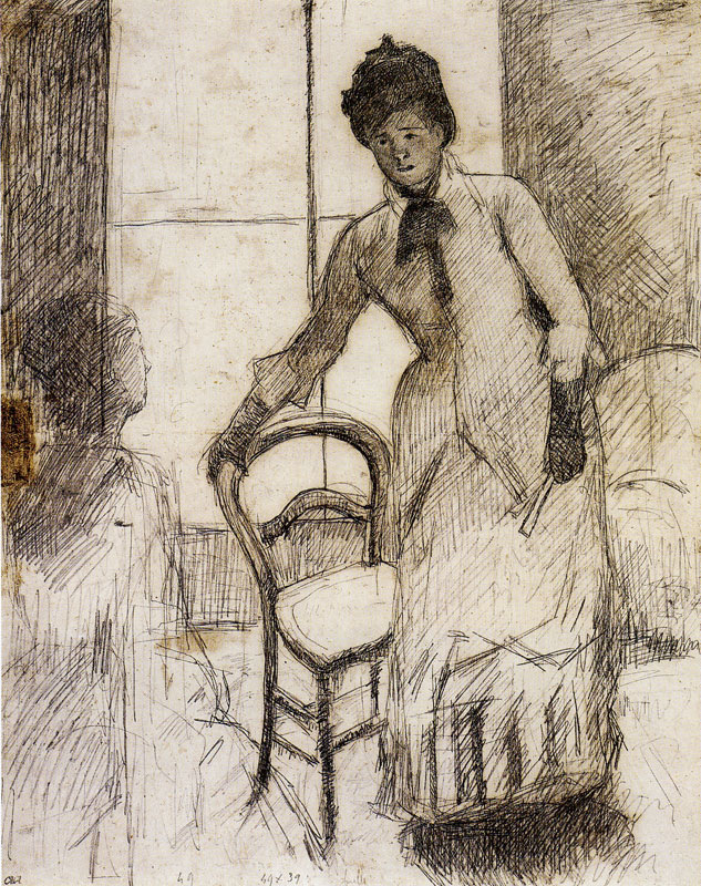
Below is a bay window with curtains and a chair. The vertical lines are an interesting element of the composition. This study is linear more than tonal.

Charcoal study, Vuillard
The portrait format below shows a busy lower half of the image with a fairly clear upper left corner. This is a distinctive approach to drawing interior scenes.
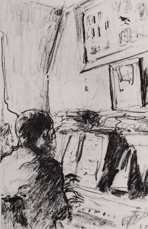
Vuillard charcoal study
Below the portrait format allows the artist to draw a view across a room, including figures, furniture and objects, as well as a tall window. This is a vibrant composition with scope for interesting details.

Vuillard charcoal study
Below is a charcoal study in the landscape format, which is at an angle from a wall. There are lots of objects and picture frames, windows and a figure in this image, which again make it fascinating for the eye.

Vuillard charcoal study.
The portrait of Jeanne Lanvin (almost square but slightly landscape) is a bottom heavy composition. Colour is important, as is line. I like the vertical lines in the upper part of the image, drawing your eye up through the background, and the bookshelves draw out horizontally across the top third. The door behind Jeanne Lanvin frames her head and shoulders, her green cardigan makes her stand out from the greys of the office.
There is a contrast between the tidy top half of the image and the cluttered lower half, which includes a small dog. The details in this image are very interesting.

Jeanne Lanvin 1935 by Édouard Vuillard
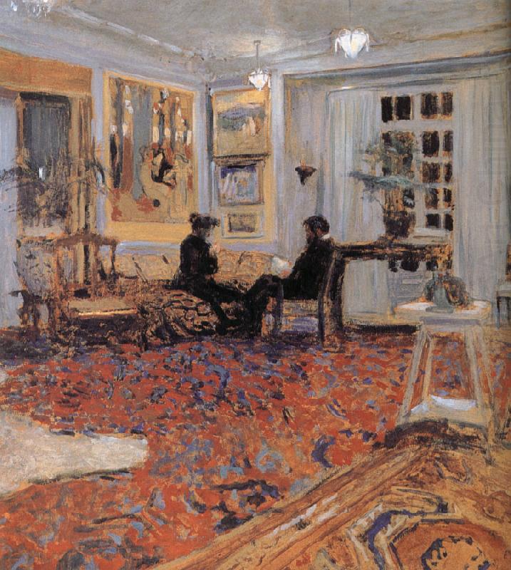
The Hessels in their Dressing room makes use of mirrors on the wall. It is a corner view of a room, which is used in an unexpected way because of the mirrors it appears as if the room continues on through the archways of the mirror frames. There is fairly empty space at the bottom of the image, which is good. You feel like you are looking down slightly.

The Hessels in their Dressing room by Vuillard
Again in this image there is a lot of carpet space, as well as ceiling space. It’s a distinctive composition style, making the figures and furniture in the distance appear far away, and giving them a border. It also is interesting because it make the image not about the figures directly as if they filled the space. Instead the image is of the room, which is all the more interesting with figures to decorate it.
“Chat” by Edouard Vuillard
The composition below has the illusion of depth, with a strange almost boxed in effect in the right upper corner. I really like the effect of looking down on the floor, and table top, as well as across toward the figures and out the window. The image has suggestions of narrative. It is fairly dark in tone.

Title unknown, Edouard Vuillard
Patterns are important in Vuillard’s paintings. Below there is also vertical lines and rectangular spaces in the image. The figure is off to the side and the wicker chairs make curiosity in the imagery. There is an empty chair and a spare hat. The doorway frames the view to the outside garden.
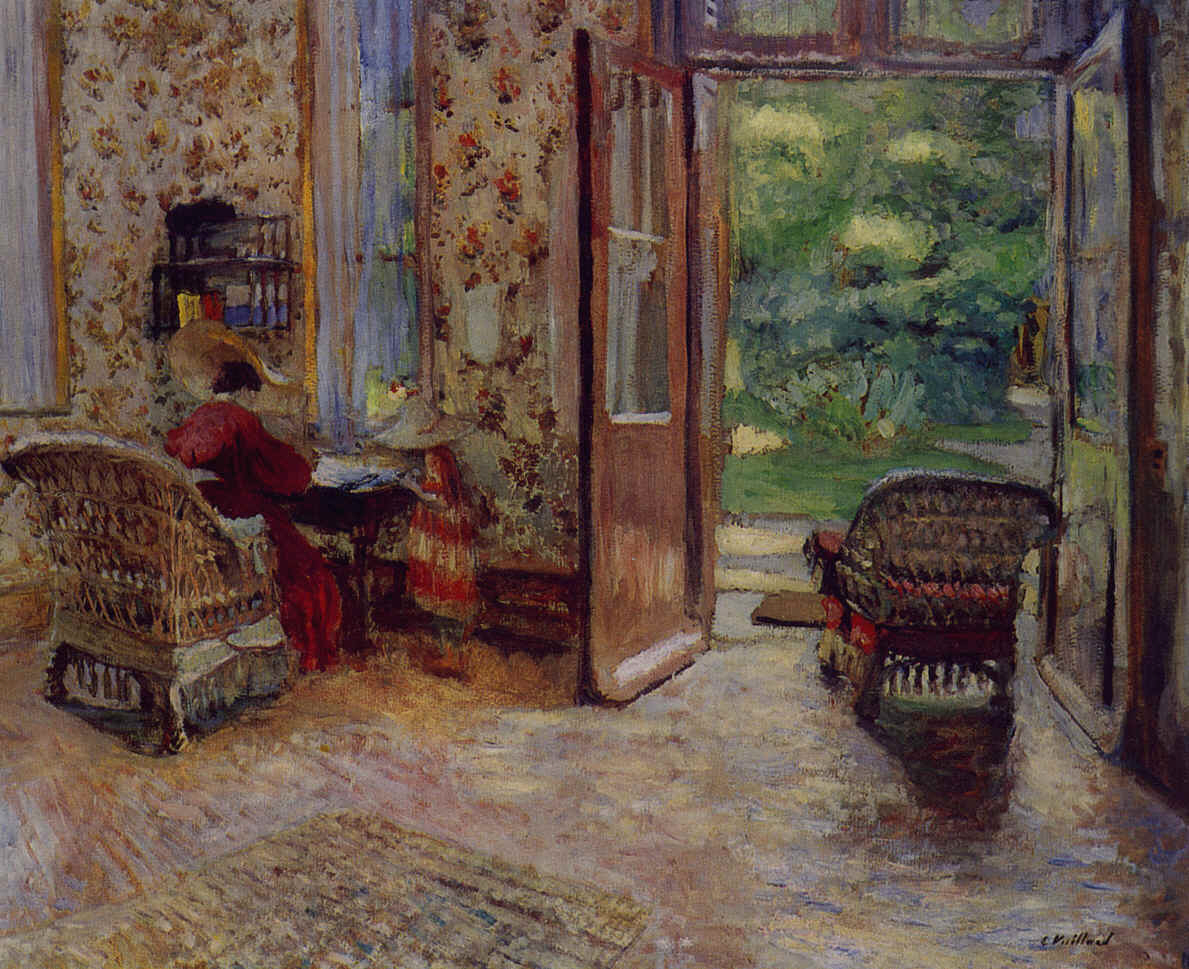
Edouard Vuillard
This image below contains vibrant colours. It has a dynamic composition because the things which are in the floor space are the woman with the dog and the armchair, which are off to each side, leaving the bookshelves and the fireplace to fill the space. Line and shape are striking especially because of the geometric shapes in the background and the organic shapes in the foreground.

Marguerite Chapin avec son Fox Terrier, Vuillard
Looking at Vuillard’s paintings has really helped me to open my mind to potential compositions and approaches to drawing from different view points.
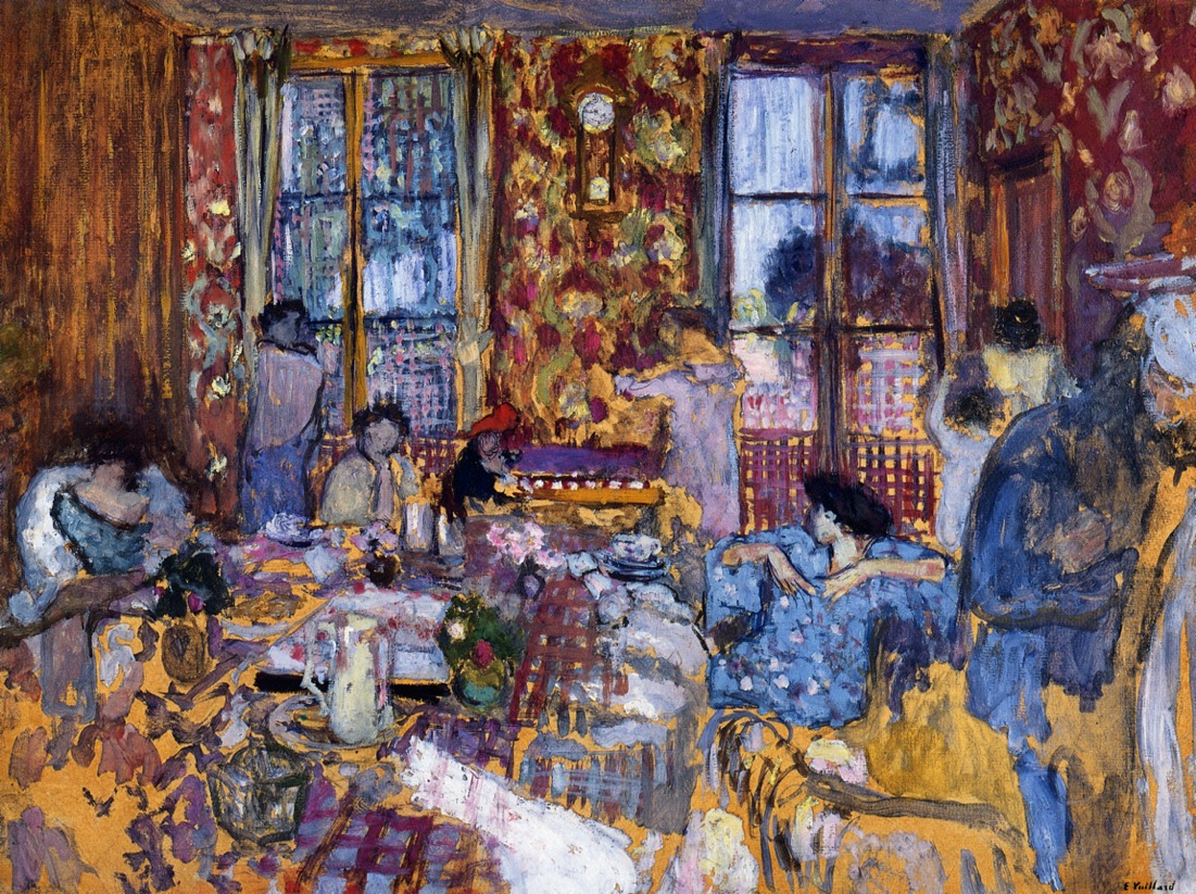
Breakfast at Villerville
The drawing above contrasts from the image below because it is loose and free and partly abstracted, while the other is more detailed and precise. Also, compositionally they are different because the view below is deep, looking across a room, through a doorway, to a mirror and a window. The view above is more crowded, the space filled with lots of people and a table, with a wall limiting the distance of the view.
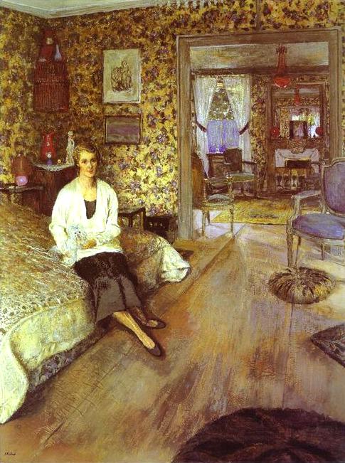
Countess Jean de Polignac, 1932
The image above has different focal points, my interest is divided between the Countess with a cat, and the view into the next room, as well as the space in the bottom right corner, which draws my eye with its relative emptiness.
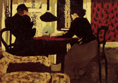
Deux Femmes sous la Lamp
The Deux Femmes sous la Lamp is a striking drawing which has the figures almost in silhouette, and the shapes around them create some contrast, while the table and chairs don’t contrast. It has a fairly abstract appearance.
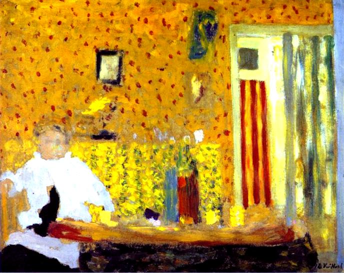
I realise now I have collected many images, so I am going to now note basic thoughts about the remaining Vuillard paintings, and then move on to Mary Cassatt.
Below is an interesting use of space in the lower portion of the image, putting so much of the carpet in the composition, the table with the figures is the focal point, off centre.

The image below makes use of the pattern, creating a puzzling dream like image with the figures and furniture camouflaged to some extent, against the wall paper, with asymmetry because of the darkness on the right.

I like the shapes of the paintings on the wall in the image below, with the figure in the foreground and the room in the space around her.

The image below is interesting because of all the objects on the table, and because it is a low view point, focusing on the table with no figures.

The image below is interesting because it is a view which looks not very deep at all, so the artist is quite closely facing a wall. I find this unusual because many of Vuillard’s pictures use large spaces and long distances.
Mary Cassatt
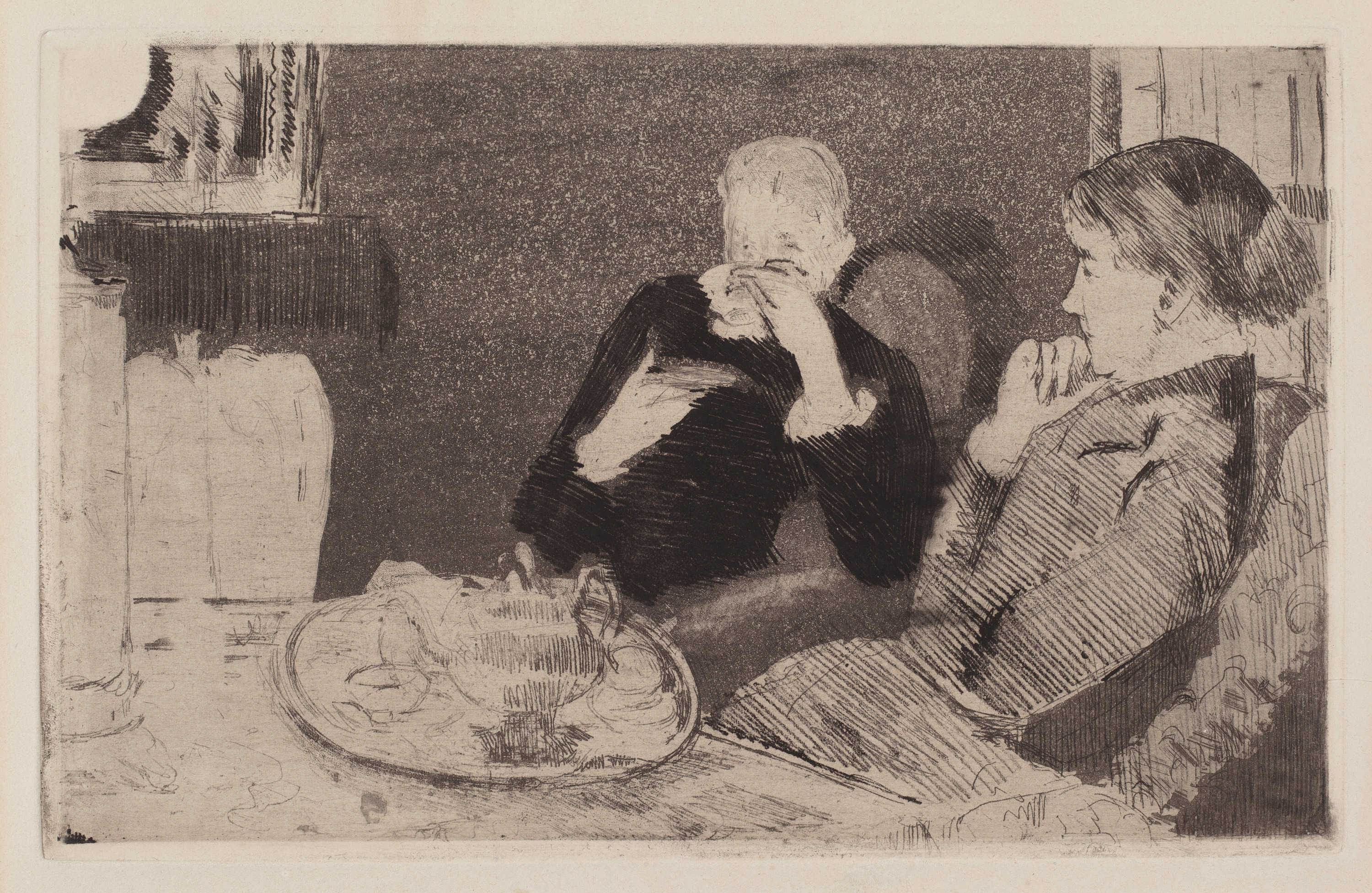
The drawing below uses hatching with very fine lines, building up different degrees of tone to describe surfaces and shadows.
The drawing below is darker, and I would like to know how the artist has created different textures of tone because the background is all speckled and the foreground is hatched while the woman in the black is possibly painted? It is very effective.
 The image below has linear qualities with fine lines and use of white spaces.
 Cassatt fills most of her interior compositions with a figure or more than one figure. The rooms are seen around the person, in the negative space of the figure or figures. This is an interesting concept.
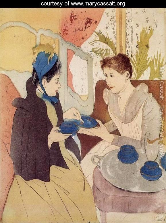
The image below has striking stripes around the figures, with a tea set in the foreground.

Tea
The painting below “Portrait of Miss Cassatt, Holding the Cards” shows a distorted or abstracted background, with white paint possibly applied with a palette knife creating a strong contrast for the figure in the foreground. The room is difficult to see, which might be because of bright lights and dark shadowy areas. I thought it was worth including this image as an example of a more abstract view of an interior.

Portrait of Miss Cassatt, Holding the Cards
“The Visit” is an ink drawing with coloured washes. This media creates a different style of drawing. The spaces are flat, filled with colour but not tone. There is a little tone on the hair of the woman on the right, and under the tea tray.
The Visit
The “Portrait of a Little Girl in a Blue Armchair” is a good use of foreground and background, with the little girl and her clothes representing the darkest and lightest places on the tonal scale, as well as the little dog, the top corners being dark places.
There is also a limited palette in this image which makes a striking impact.

Portrait of a Little Girl in a blue Armchair
In the drawing of Alexander Cassatt and his son, the figures fill up most of the space. There is a strong contrast of the black clothing against their pale skin and pale walls.
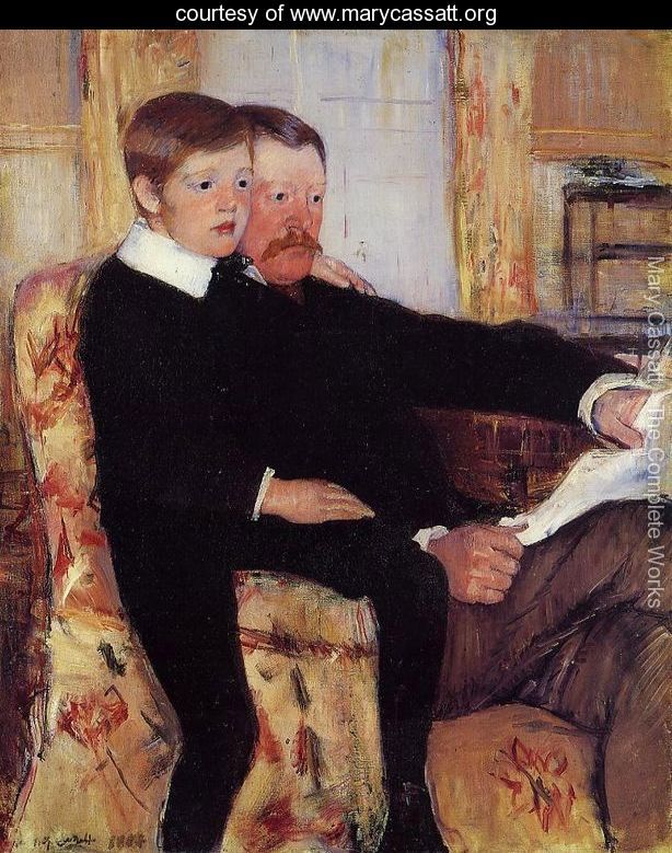
Portrait of Alexander J. Cassatt and His Son Robert Kelso Cassatt.
Below is a pastel drawing “Mother Combing Her Child’s Hair”. Cassatt uses hatching and zigzag lines for clothing and upholstery, with smoother blending for walls, wooden furniture, skin and hair. She makes us of the reflection in a mirror, which adds interest to a composition. The contrast in this image is not as striking as it is in Portrait of Alexander J. Cassatt and His Son Robert Kelso Cassatt, but there are dark shadows on the hands, arms and on the chair.

Mother Combing Her Child’s Hair, 1901
“Reading Le Figaro” is another drawing which makes use of a mirror to make the image more interesting. The space in this picture, as many others by Cassatt, is mostly devoted to the figure; I included it because it was an example of how a mirror can affect the illusion of space in a room.

Reading Le Figaro, 1878
Edgar Degas
Portrait in a New Orleans Cotton Office has dark black clothing and white shirtsleeves with white cotton wool. These figures and items are effective for creating contrast. It is worth considering when searching for or compiling a composition or scene to draw, to search out strong or subtle contrasts which suit your purposes.
The inclusion of the ceiling and the floor in this image help to survey the largeness of the space, whereas the figure seated in the foreground seems to crowd the viewer, distinguishing the smallness of the room.
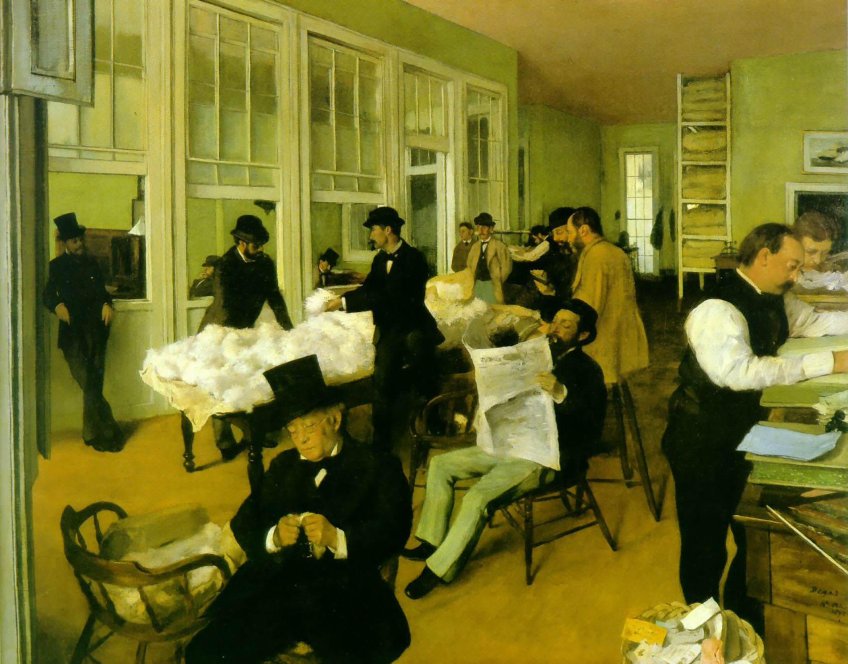
Portrait in a New Orleans Cotton Office
In a Cafe 1873
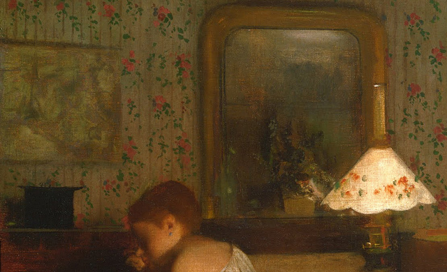
In a Cafe has a dynamic composition and shadowy tone with the contrast of the lamp in the corner. The view of the room is not very deep due to the proximity of the artist to the wall. There are linear aspects with horizontal line behind her head and vertical lines of the mirror and the picture on the wall. There are vertical lines in the pattern on the wallpaper. The darkest areas are at the bottom of this picture, but so are the lightest tones. This is a really strong composition.

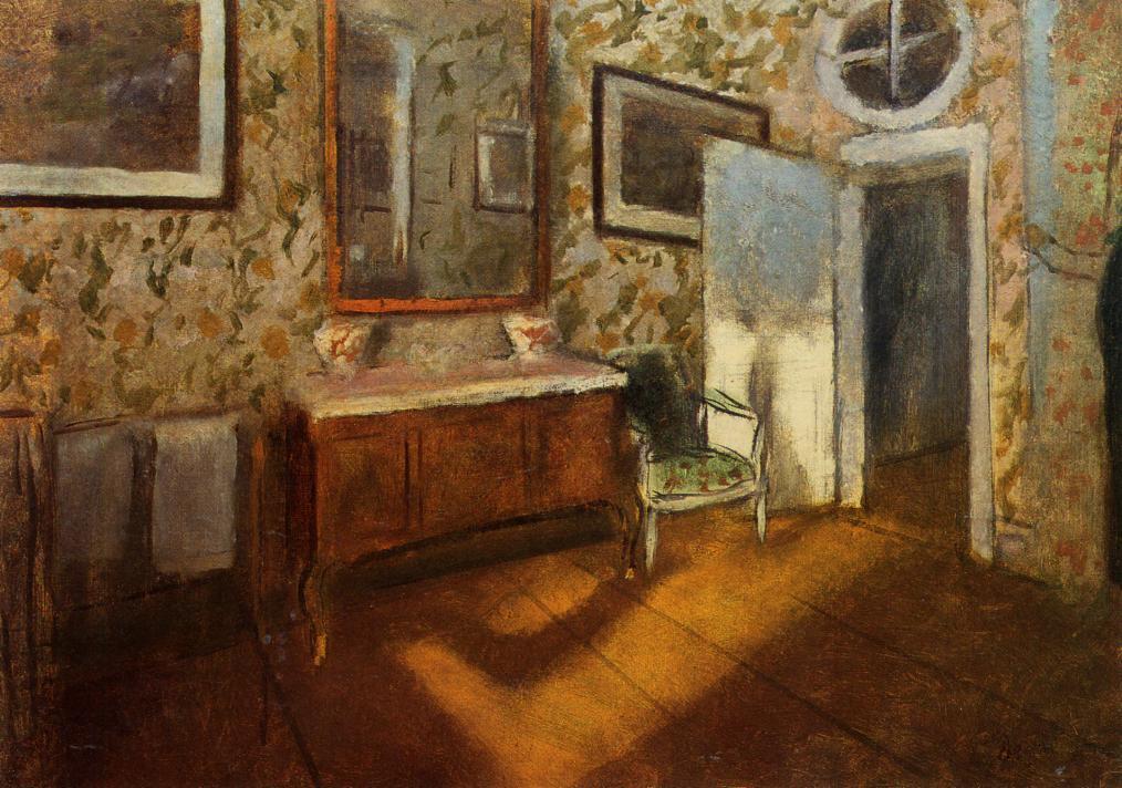
The Billiard Room at Menil Hubert, 1892
The Billiard room at Menil Hubert is a good example of a room without any figures in it. It has contrasting tones with dark shadows and pale highlights across most of the picture. The artist makes use of colour, and the pattern on the carpet almost seems to move.
Interior at Menil Hubert 1892
Interior at Menil Hubert is another room without any people in it. There is a limited colour scheme with brown and beige being the most noticeable. The shadows on the floorboards are striking, with the strong pool of light shining down through a window. This is a good example of how a particular time of day can have an influence on your picture.
