Research point: Investigate some artists self portraits. Look at both well-known self portraits – such as Rembrandt and van Gogh, and at lesser known artists. Make notes in your learning log.
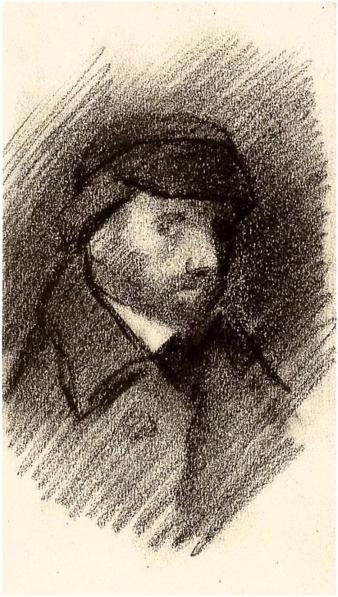
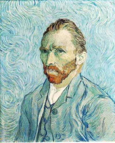
Vincent van Gogh
First I decided to look at well-known self portraits so I looked at van Gogh, like the exercise suggests. 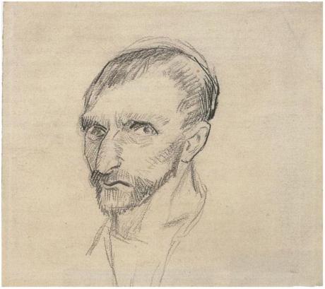
I managed to find two self portrait drawings, one in pencil and one in charcoal. These are good examples of how you can use line and tone to describe the face.
I also am including some painted self portraits because I think that the techniques could be transferred to drawing, relating to colour and mark making.
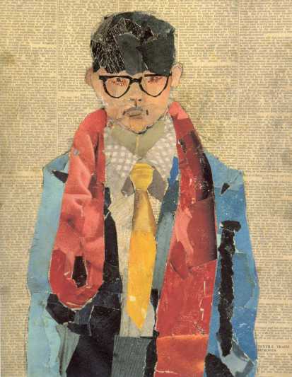
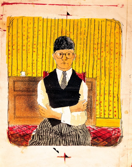
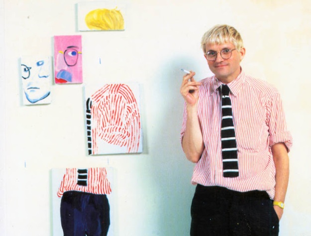
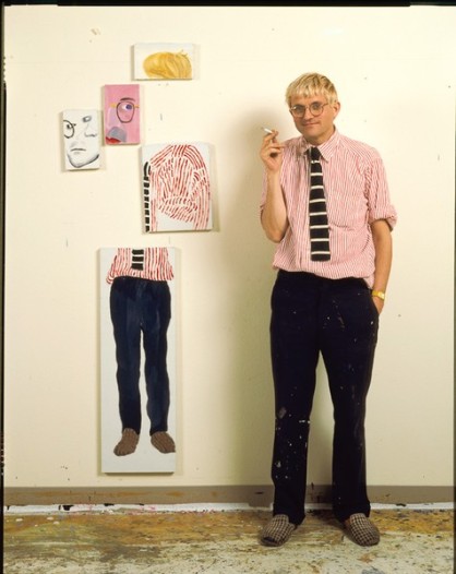
David Hockney
I like this collage self-portrait (above). It has an excellent textured feeling about it. It has an appearance of weight and depth. The combination of ripped and cut lines is really effective for giving the illusion of three dimensionality. I look at this picture and I see the person in the scarf and shirt before I consider that it is made from a collection of papers.
This second self-portrait (above) has a grainy quality – I like that it ends within the space of the page. This drawing is precise and stylised at the same time. It is suggestive of narrative, inviting the viewer into a (cosy?) picture book world. The limited palette works really well.
This alternative self-portrait is unique and special. The fragmentation of the figure is curious and a little disturbing.
Felix Nadar
I came across Felix Nadar’s revolving self-portrait in my research of famous self-portraits. Even though it is a photographic example of the self-portrait, the eccentric way he records himself from every angle is relevant conceptually and compositionally to what I am studying. The idea of a series is also very effective for displaying self-portraits.
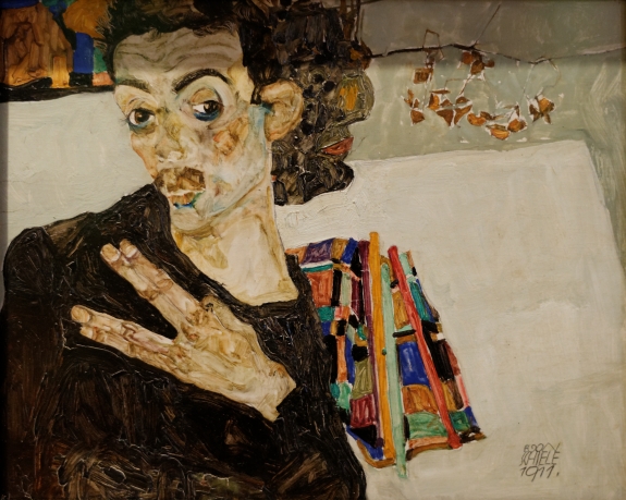
Egon Schiele
Egon Schiele’s self-portraits have objects in the background which divert the eye. They have character, the expression on the artist’s face is intriguing, it seems to be one of calm, thoughtful fascination. Most of the colour is neutral, except for the objects in the background.
I like the way Schiele adds colour to the skin, making it look mottled like clay. I would be interested to try to find colours like that in the figures and faces I draw.
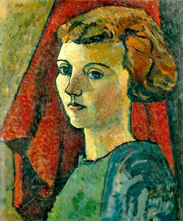
Eileen Agar
Eileen Agar’s painting has strong dark outlines, building up the surface areas with dots and dashes of paint. This picture is quite dark, with the dark tones and the colour scheme. The lightest parts are on the face and neck, which makes it the focal point of the image.
John Bellany
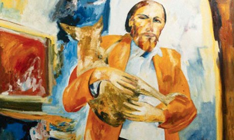
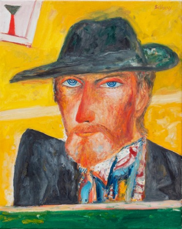
John Bellany’s self-portraits are a little unnerving to me. I don’t know exactly why I find his images so uncomfortable, assume it is because of the way the figures seem to glare, and because the colours are often exaggerated on the face. He has a personal way of drawing eyes which have sharp edges at either end.
Eeriness aside, I like Bellany’s use of colours and lines. In the image above I especially like the patterns on his shirt. I like that you can always see the way colours have been applied on a surface – nothing is ever smooth, there are brush lines and inconsistencies of colour as if he mixed his colours on the page. It gives me the impression of a wrinkled or crumpled surface which has been smoothed out again, as if everything in the image were made out of paper or fabric.
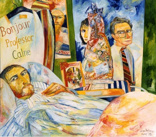
I think that some things in the image below, for instance the bed clothes and the pyjamas and the sky out the window, have the look of cake icings. As if they were different coloured icings stirred together but not quite combined.
I also think that this image seems private – it feels like seeing something you should not see.
Peter Blake
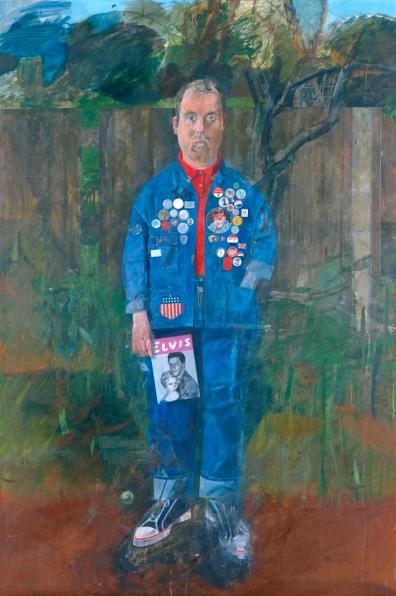
I really like Peter Blake’s Self-Portrait with Badges. I have seen it in real life in Pallant House Gallery in Chichester. It is impressive and large. The attention to detail is absorbing because it draws you into the image.
Blake’s picture has a diverse combination of textures and surface detail, with smooth areas of fabric, shiny buttons next to scratchy tree foliage and wooden fence planks which are linear and slightly textured.
It is compelling the way he blurs parts of the image too, for example the feet in this image – one is blurred out, while the other is crisp and detailed. You can see that the blurred one had a lot of detail, and you can see that the crisp foot has been adjusted to be smaller than it was in the original sketch. Leaving imperfections such as these adds intrigue to the image.
Even though there is lots of background in this picture, Blake’s figure stands out strikingly because of the colour of his clothing and because he is in the front centre of the composition.
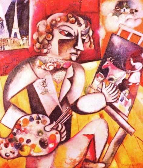
Marc Chagall’s self-portrait is incredibly imaginative. It even has a thought bubble in the corner. The facial features are adapted from reality with angular cheeks and nose, pod shaped eyes with inverted colours, and a tiny little chin sitting below the bottom lip. He has also given himself seven fingers, as the title suggests.
I like this drawing because it shows how your imagination can alter the way you perceive reality, and therefore how you experience reality.
I think it is illuminating in showing us how you can draw from life, draw the characteristics of things while also changing them to be something else. It is striking that the figure is recognisable with so many alterations present.
I have looked into the history of this painting and apparently seven fingers is a metaphor from folk lore which means “I am working as hard and as fast as I can”. The angular qualities of the face are from influences of cubism, which is an approach in which the artist breaks things up and puts them back together again.
Lesser known artists:
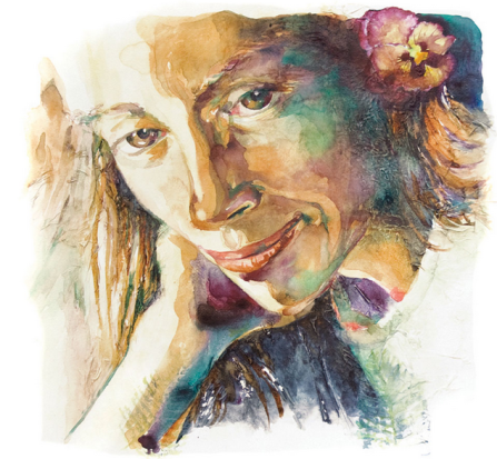
René Eisenbart paints self-portraits because she is an ever present model, she does not need to convince or pay or bribe another person to sit for her to draw. She uses watery colours and blends blues, greens and purples into the shadows of her images.
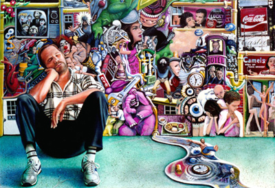
James Sebor – Self-Portrait
I am sorry that I could not get a larger image of this painting. Sebor is a contemporary American artist who makes surreal images. I like his self-portrait because it alternative to what I have frequently found. There are lots of images around and especially behind him, so that the picture says a lot about him, perhaps from his interests or his past. There are lots of symbols in this painting, like the stream of water draining away beside him, with a clock and a tiny man being taken by the current. There are two clocks in this picture, which might represent time passing by. And there are eyes watching too. There is a lot packed into this drawing, which I would not have considered you could put into a self-portrait. You can say a lot more about yourself and/or your life beyond your physical appearance.
Linda Edkins Wyatt
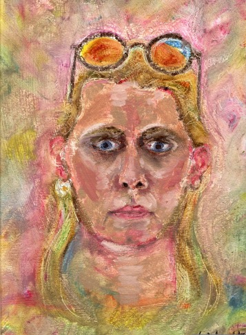
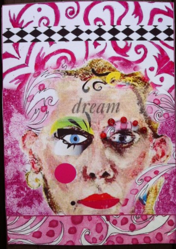
Linda Edkins Wyatt worked into photocopies of her original self-portrait, adding collage papers, distorting and abstracting the image to have more decorative qualities and as a cathartic emotional experience of art making.
Isaac Hernandez Herrero
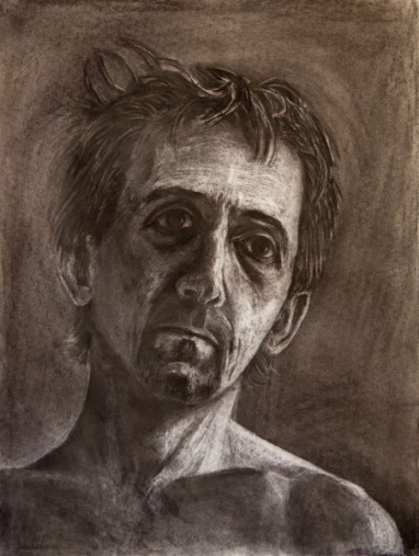
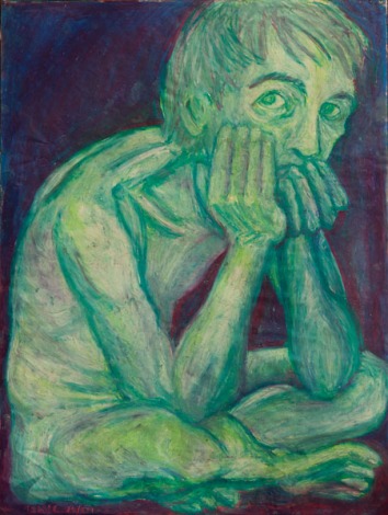
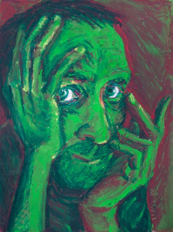
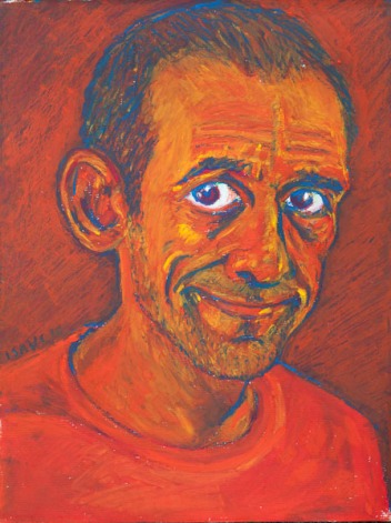
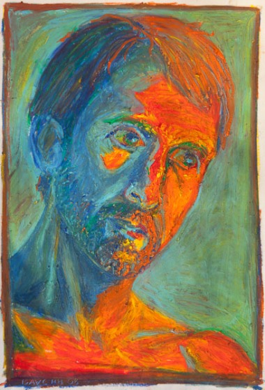
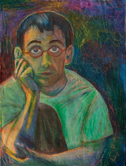
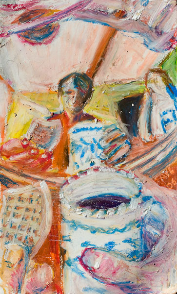
Herrero is an artist who has made a large selection of self portraits in a range of media. They are a good example of the wide range of ways you can approach a self-portrait, partly because of the different ways the figure is portrayed; the different postures and expressions of the figure as he looks out at the viewer.
In the image below the whole body is drawn in, and it is tightly fit into the page space – with the top of the head cut off.
The artist uses a limited palette which is very effective.
This image (below) has a dramatic light shining on part of the face, which creates good contrasts and shadows. I like that the artist has used blue instead of black for the shadows, which makes this image easy on your eyes; he is enabling you to see what is in the shadows compromising the illusion of depth and three-dimensional form. The colours work really well together.
The image below has a different atmosphere to most of the self portraits I’ve found by Isaac Hernandez Herrero – he has scratched textures into the space around the figure, and the whole image is fairly dark. Having said that there is a glowing effect which I am unable to entirely make sense of. I see that he has made a pale outer line around himself, possibly scraped away from a layer of oil pastels. I cannot be sure how he has managed to make his T-shirt appear to glow green, at the same time as being a fairly in keeping with the dark, shadowy parts of the image.
It’s a great drawing, you can see how he has built up colour and tone using line, especially on the arms and hands.
The image below is really interesting – I love it! I think I enjoy it so much because of the colours, they are light and they work well together: pale with bright blues, pale with bright yellows, pinks and white. It is fascinating because at first it looks like a still life of a cup of tea, and then your eyes find the figure in the centre of the image. It has a dreamy atmosphere and a soft focus. This is a really comfortable image which draws you into another world.
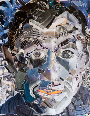
Above is a drawing made entirely out of collage, which is an alternative approach that I had not previously considered. This is another way to create distortion and you could make a drawing of a collage of your image, or of a collage of a drawing of your image.
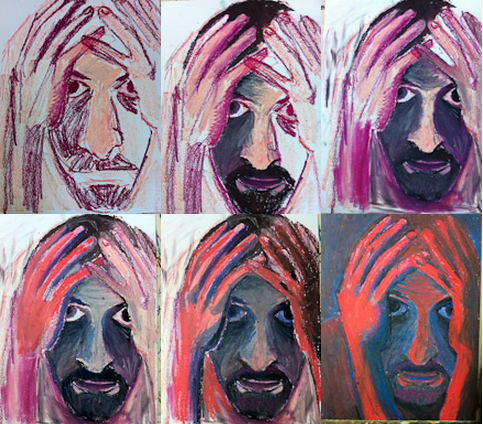
This series of drawings (above) shows how an image can change without the pose changing, and how multiples of an image can alter the effect or impact of a drawing.
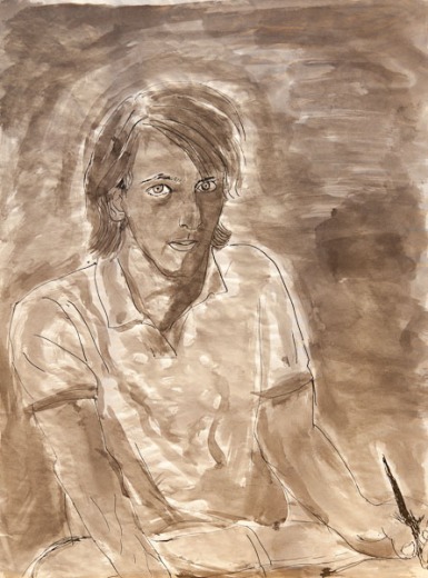
Below is a study made with inks. I think it is a thought-provoking contrast to the other more brightly coloured studies.
